Interested in Trucks?
Get Trucks articles, news and videos right in your inbox! Sign up now.
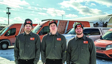
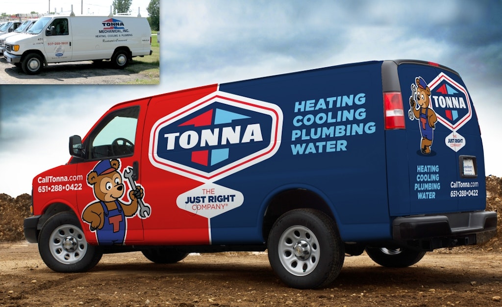
Trucks + Get AlertsTrucks aren’t simply service vehicles. They provide a great canvas to advertise a company brand. However, according to marketing expert Dan Antonelli, the design of most truck branding simply, well, stinks.
Antonelli is the author of Building a Big Small Business Brand, and CEO and creative director of Graphic D-Signs Inc., a New Jersey-based advertising agency that works with small and mid-size companies. He’s been in the business since the age of 14 when he hand-lettered trucks old-school style. Today’s signs are largely vinyl wraps applied to the surface of the truck like massive decals.
“Truck wraps aren’t cheap, so it’s a shame to see them done badly,” Antonelli says. “When they’re done right, they can generate sales leads and build a great identity for the business.”
Wraps also offer a side benefit. “They protect the paint underneath,” he says. “I’ve seen vans where, after the wrap has been removed following three or four years, the paint underneath looks brand new.”
Antonelli shares six tips for effective truck wrap design:
1. Develop a solid brand first
“Your brand should be the primary message for a vehicle wrap,” Antonelli says. “Unfortunately, many times a brand starts with a rush job at a sign company or a company that prints business cards. If you start with a poor brand, the wrap will be a waste of money and a missed marketing opportunity.
“Most brands telegraph a neutral or negative brand promise and that tells me you’re not professional and that you should synchronize what you’re charging with that image. Consumers are willing to pay more for a premium brand experience. If you’re on the higher end of the pay scale, you’d better look like you deserve it.”
Antonelli advises owners to examine their current brand and ask themselves if it represents the company’s mission and goals, and whether those are recognizable to potential customers. “If your brand is dated, illegible from a distance, uses clip art, or isn’t memorable or unique, it may be time for a change,” he says.
He warns companies to develop a brand that will work well at all sizes. “You can’t develop a brand to fit on a business card, then blow it up to truck size,” he says. “However, you can take a good brand designed to work outdoors, then scale that design down to use on stationery, uniforms, caps and business cards. A good design company will provide you with a guide that shows you how to implement that design wherever you use it.”
2. Don’t use photos
A photo is not a brand identity, and any company who uses one is probably doing so at the expense of a better brand identity, says Antonelli.
“I’ve seen very few effective wraps that use photos,” he says. “A picture of the owner and his family won’t inspire consumers. If you show me a picture of a piece of equipment the company works with, I will know what you do, but it doesn’t connect me with the brand. Also, when that piece of equipment goes out of date, the photo will need to be replaced.”
3. Don’t use “nephew art”
“Too many trucks are designed by a ‘nephew who is good at art’ or a ‘guy who is good at Photoshop,’” says Antonelli. “It often seems like the path of least resistance to use a family member and once you start using that design, it can be painful to get rid of.”
Some companies claim that a poor design seems to be working for them, so they see no reason to change.
“I tell them that success in spite of a poor identity is not a reason to perpetuate it,” he says.
4. Limit your advertising copy
“Don’t fill your wrap with a bullet list of every service you perform,” Antonelli says. “It’s not a Yellow Pages ad. I would rather say less and have potential customers remember more, than list 10 services I perform and have potential customers remember none of them.”
He says a good wrap design requires no more than four items: strong brand implementation, tagline messaging or slogan, a Web address, and/or a phone number, prioritized in that order.
Antonelli also cautions truck owners not to obscure any legal or regulatory information that must appear on trucks, such as licensing or load limits.
“We’ve worked on tanker trucks, where the wrap takes up a significant stretch around the middle,” he says.
5. Design to stand out
Antonelli recommends that truck wrap designs avoid most of the noise and Photoshop effects on which amateur designers often rely.
“Get rid of all the flames, lightning bolts, fills, glows and bevels,” he says. “They litter a truck wrap with visual noise that obscure the message you want to get out. Something that you can actually read and remember will stand out among all the visual clutter that’s out there.”
6. Simple and obvious is good
Most truck wraps are viewed briefly in traffic. “They’re looking at your truck for two seconds at 40 miles per hour,” Antonelli says. “If they need to work to figure out your primary brand messaging, it’s a lost opportunity. This isn’t a print ad where the viewer has time to absorb the advertising and try to understand your message.”
Ask yourself these questions as you begin the process of designing an effective truck wrap design to convey your brand: Does the wrap clearly communicate one important takeaway? Does it do the same thing when it’s viewed from a distance?
“If so, well done,” Antonelli says.